A Look Behind the Scenes

I thought it would be fun and interesting to document the development of my projects. This first post, about my First Listens visualisation, is a bit rambly, partly because there was a lot to fit in, and partly because I wanted to get this out there into the world rather than sitting on it for too long and making it perfect. Regardless, I hope there's something in here that's interesting.
Beginnings of the Data
I've been keeping track of the albums that I listen to for the first time since 2017. I'd recently gotten an Apple Music subscription and I was enjoying that newfound freedom by actively seeking out lots of new things. I was disappointed though with their history/record-keeping because they kept recommending me things that I'd heard before, and I often couldn't remember whether I had or not. I decided that I should just keep track myself.
During that first year the list was not very detailed, just the album and the artist. But as the list grew I thought it would be good to keep to start keeping more information, particularly the date, and my simple format grew in size from 2018 onwards.
I keep the lists on my iCloud notes, and write them in a weird little format that I find easy enough to type and read, but that can also be parsed by a computer. It follows this general format:
Artist {
> Album [comma-separated fields]
The comma-separated fields I currently use are date, order (to track the order I heard them during that day), rating (I categorise them into a rating out of 4, with 4's having entered my music library, 3's having the potential to be in the library with a few more listens, 2's being fine, and 1's being those I actively disliked; most are 2's, with very few 1's), year released, length in minutes, and a general comment.
I wrote a python script to turn that text list into a CSV file, an R script1 to clean up and further format some of the fields, and a bash script to automatically run these in sequence through the terminal, giving me a nice formatted file to do with as I please.
Previously Visualised as...
I've previously visualised my album data as an artistic plot, when I hit 2,000 albums at the end of 2022:
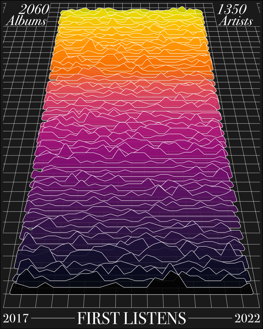
Here, the lines show each month, while the height of the peak shows the number of albums in that day. I still like this output a lot, but it's much more artistic than it is informative. I never intended for the viewer to be able to tell that I listened to 4 albums on 5th February, 2020!
Good data visualisation should be able to tell an interesting story, but I appreciate that there's not anything particularly interesting about these data. So, this time around I wanted to make something more informative, while still leaning into the artistic angle to give it a bit of that interesting flavour.
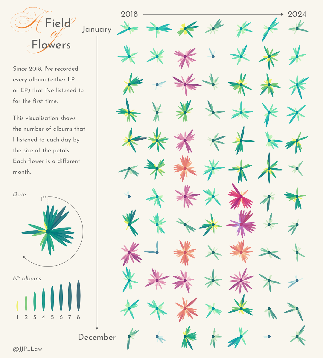
A Field of Flowers
Initial R plot
Unlike previous attempts at visualising these data, where I spent a while messing around and coming up with multiple versions before landing on the above mountainous lines, I had had the general idea of using what is essentially a radial bar graph before starting work. I experimented a little with using lines and rectangles for the days, before thinking that ellipses would look nice by mimicking a flower's petals. I quickly found there was nothing in vanilla ggplot that could create the ellipses that I wanted for the petals, so I used Thomas Pedersen's excellent extension, ggforce, to draw them. This meant a that I had to calculate some of my own coordinates rather than letting ggplot transform the data itself, but this would prove quite helpful down the line!
There are lots of design choices that go into developing good visualisations, and these are some of the choices I made while making the overall plot:
- The size of the petals are scaled according to a log-transformation of the number of albums, because directly scaling the two looks clunky, unnatural, and generally unlike petals.
- The colours are picked from sequential colour palettes in the HCL colour space, using the
rcartocolorandcolorspacepackages. These palettes are generated to have distinct hue and value through the range of the palette, making each level easier to distinguish.- I dabbled with randomly distributing the palettes among the flowers, but ultimately landed on assigning the palettes according to a binning of the number of albums in a month — months with more albums have warmer and more vibrant palettes.
- I wanted the flowers to be distributed evenly, and specifying aspect ratios when saving plots in R isn't the simplest thing in the world. Through a lot of trial and error, I found that for a given width the height of the final plot should be:
- Width × (Y–axis length × [1 − left margin − right margin] / X–axis length × [1 − top margin − bottom margin])
Once the main plot had taken shape, I then worked on developing the two legends, which are two separate individual plots. The legend for the dates is an annotated version of the August 2022 flower, the month where I listened to the most albums, while the legend for the number of albums is a bespoke plot of the petal sizes. I wanted to keep the legend minimalist, showing the necessary information to read the graph with as little extra text as possible. I also decided that it was unnecessary to specify why the palettes for each of the flowers differ, because this is almost purely aesthetic.
I laid out the plots together in R as well, using the cowplot package. I find this package very flexible when laying out complex plots, because of its ability to layer ggplot objects on top of each other. It was a very fiddly and time consuming process of fine-tuning the exact locations of each element, but I wanted to achieve this directly with the code in R to avoid having to open up another program and make further adjustments whenever the data was updated. In the future though, I think I would try and develop only the necessary parts in R (or whichever code package) and then lay them out in a dedicated layout software, just to avoid this faff.
I'm very happy with the final static image, but this is 2025 and I think it could be greatly improved with a little bit of interactivity!
Going Interactive with D3.js
So, I've decided that I want to make an interactive plot, but how? On an initial look into Plotly for R, the first candidate that sprang to mind, I decided that, though clearly an incredibly valuable tool to learn and one that I will aim to explore, it didn't seem to have the necessary feature set to do everything that I wanted it to. Similarly, something like Shiny for R, though something to look into in the future, seemed to be more suited to datasets with a lot to explore.
I found out about D3.js from an interview in the Data Visualization Society magazine, 'Nightingale', and on further investigation I saw it described as a lower-level graphing library suited to bespoke visualisations, which sounded like exactly what I wanted, and would also have the power of web programming behind it to do whatever I could think of with the interactive elements.
My initial vision for the interactivity was that the viewer would be able to click on a flower to zoom in, and then by clicking on a petal this would open a popup at the cursor's location that would have a scrollable list of the albums I listened to that day, with each album having its album artwork and some other information about it, such as a link to listen.
There was a steep learning curve with D3, even with just getting it to load the data — I've probably got quite a way to go still with understanding promises in javascript! On getting started, I personally didn't find the examples in the documentation or on Observable's website particularly helpful, as they were all geared around using their notebooks feature. Instead, I made particular use of D3 in Depth, and this script/page, made by Danny Yang, that I found on Reddit. With this, I was able to get the plot itself up and running relatively simply, as I'd already done the necessary calculations for positioning and design work in R.
Implementing the interactivity involved a lot more thought, with several hurdles to clear:
-
Making a popup when a flower was clicked — I settled on creating a second SVG element that would cover the first, achieved by giving the second a negative left margin the width of the first.
- As I write this, I can't remember why I landed on this approach rather than adding these popup layers to the original SVG element, and I may investigate to see if this could be optimised slightly — regardless though, it worked!
-
"Plucking" the petals when they're clicked — making it so that they pop out when selected was simple, but handling the situations where they should pop back into the flower (clicking another petal, or clicking the popup background) was tricky. The series of logic to handle this was a little confusing at first, but working through a bit of pseudo-code helped immensely:
if (I am not highlighted AND I am clicked) { Highlight me } else if (I am highlighted AND I am clicked) { Clear me } else if (I am highlighted AND another petal or the background is clicked) { Clear me, Highlight the other petal (if one was clicked) } -
Moving the plucked petal to the top layer so that it's not obscured by any other petals (the petals are drawn in order from biggest to smallest, so that they're layered nicely), but then have it return to the layer in which it started once it's no longer selected — this was mostly only tricky because of having to mix and match between D3's element selectors and javascript's.
-
Deciding where and how to show the information — doing a popup at the cursor as I first imagined would've been a bit too busy, as there would be quite a lot of information to show. I decided a static box in the sidebar would be better. I'm very pleased with the way that the information is displayed, and importantly cleared when the relevant elements aren't selected anymore.
-
Highlighting which days have albums that I'd recommend — I liked the idea of having options that could be enabled to give informative views of the plot. From previous dabbling with album data I've found that it's very difficult to programmatically get album artwork — my idea of showing the artwork for every album quickly went out the window because it would've meant manually finding and saving >2,000 images. I settled on only having artwork and listening links for albums that I would recommend (why would I tell you to listen to something I didn't stand by?), and so then I needed a way of showing which days had these albums. I added this quite late on, and it involved putting in an extra layer of checks at multiple points (to see if the option was selected) so that everything was highlighted consistently between the main image and the popups.
- I'd like to add more options, but I haven't been able to think of anything other than adding a search bar — suggestions would be great, but otherwise I'd like to move on and possibly revisit these at a later date.
-
Mobile functionality — most of these features just work on mobile as well, but I had to think about how best to organise the information for a vertical scrolling layout. The main feature here came after a suggestion from my brother, which was to add some buttons that scroll between the popup and the information box, because on mobile it's not immediately clear when you open the popup that there's any further information.
-
Opening the popup for today's date when clicking through the image on the homepage — after my dad, rightly, tried to click on the homepage graphic to get to this plot, I decided that, not only should that image link to the project page, the page should open showing the popup for the highlighted day. I also found that, having opened the page to the popup, I wanted to be able to press 'back' to reopen the popup if I clicked away, but, because the interactivity is achieved all on the one page, pressing 'back' doesn't do this on its own. I had a bit of fun exploring the world of dynamic sites and single-page applications as I implemented this using the history API. I used the URL search parameters to store the date information, which is saved to a history state that can be reloaded quietly on the same URL, which I think is neat.
- It seemed cumbersome and overkill to do this for every single popup, as one session looking through the plot could generate tens of different states to try and click back through.
The last thing I did was to optimise the layout for mobile. As mentioned, everything worked fine on mobile without any optimisation, but it was very small and hard to use. Though I was slightly resistant to at first as it seemed too focused on the web development side rather than the visualisation side, I'm glad I did because so much of web access is through mobile and if I want to do more of these then I've got to make it look good everywhere.
Conclusions
I knew going into this project that creating an interactive figure would be difficult — there's a reason that every figure isn't interactive already! However, despite the difficulties and frustrations, one of which contributed to me taking an extended break from working on this, I really enjoyed the process of piecing together the things that make a website interactive, and the sheer number of little things that are required to make the page useable and behave in a predictable way. Through making the page, and optimising it for mobile, I learned a lot about not just D3, but javascript, the DOM, SVG manipulation, and CSS.
I look forward to making more interactive plots in the future!
I wrote the first script in python because I was learning bits of python at the time and wanted a reason to practice, whereas the second script was in R because there were some formatting things that I found far easier to achieve with it, and also because I wrote the R script at a much later date when I just wanted to get it done quickly. ↩︎