Why a Jumper, Anyway?
I was looking on Rapanui at their sweatshirt collection and found that they could print me a custom design on whichever jumper I wanted, at quite a reasonable price. And as I was flicking through their custom stock design elements I realised that, instead of cobbling together a few of their graphics into an unsatisfying mish-mash, I have the ability to design my own graphic. And of course I settled on making a new visualisation of my listening data!
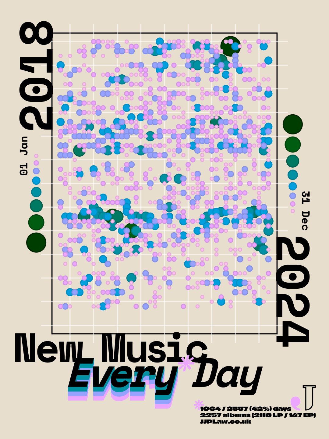
Because the visualisation was for a jumper, I wanted to make a fully artistic interpretation of the data — it doesn't need to be legible to someone looking at my back. I'm a fan of dots in data viz (I really like circles) and decided to go for a simple calendar grid where days that I listened to albums are shown with dots, their size/colour showing the number of albums for that day.
Making an Artsy Viz
As with any data visualisation I've made, all the data were wrangled and dots plotted in R.
I sized the grid in a 3:4 ratio, 45x60 dots, to match the ratio of the printable area of the jumper. I left in the empty space that follows the final day in the range, both because 2557 doesn't fit neatly into that ratio, and because I like the implication that the project would continue, to eventually fill that space once 2025 was complete.
I chose the colours using my favourite data colour palette creator, HCL Wizard. I love the way that the sequential palettes move through the colour space, changing both hue and luminance so that each colour will be visually distinct in multiple ways. And I chose the sizes so that they deliberately overlapped in interesting ways. Circular size isn't the best way of showing this kind of discrete data on an informative level, but this isn't an informative visualisation and I think it creates an interesting pattern here.
Adding the Other Elements
I made this in October 2025, and was playing a lot of late '90s PS1 racing games at the time: the Wipeout series1, Ridge Racer 4, and Colin McRae Rally 2.0. These games have a fantastic sense of graphic design, with beautiful and interesting menus and typography. In particular, I was inspired by the work of The Designer's Republic™ on Wipeout 32, having just recreated the menus and team logos for a custom muOS theme using the identities included in the WipEout Futurism book. In the end my design doesn't much resemble these games, leaning more heavily into a late 2010s poster style, but that was the original inspiration at least.
I did the whole layout using Inkscape3, importing just the dots themselves as an SVG from R.
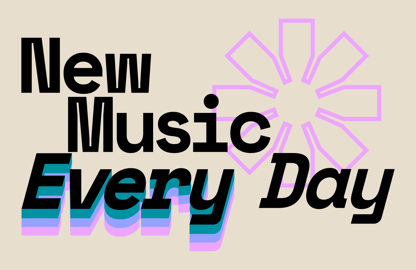
I came up with the title slogan of "New Music Every* Day", to fit the sentiment of my ongoing listening project — I love listening to new albums as much as I can — but with the cheeky caveat of the asterisk — I've of course not listened to a new album in full every single day for 7 years!
The main title is set in a manually kerned Space Mono so that I could use the letterforms I liked without using the monospace (though I kept it for the years and dates). I wanted to emphasise the "Every" by having it echo repeatedly, and I tried multiple different ways of arranging multiple lines of text before finding the "extrude between paths" extension in Inkscape to create this more 3D stacked look. The smaller text is set in Climate Crisis, and its size, as well as the lines throughout the visualisation, needed to be at least 1 mm thick, according to the guidelines from Rapanui.
Because this graphic was going to go on the back of the jumper I wanted a little badge to go on the front. I rearranged the title to fit better on its own, and also emphasised the asterisk as its own element — I wanted it to be larger on the back as well but ultimately it didn't fit right.
Receiving the Finished Jumper
After lots of fiddling to arrange everything perfectly I finally submitted the designs and ordered the jumper. It took just over a week to arrive, and when it did I found that they had misprinted the front — the purple came out as pink and the green didn't come out at all, leading me to think that they'd not printed the c from cmyk.
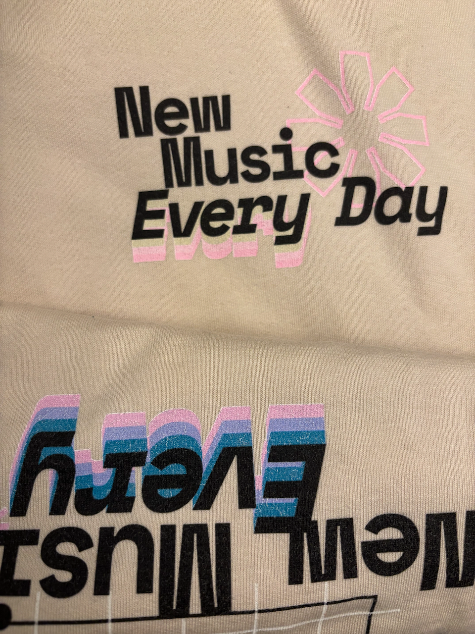
Because of this, they refunded me and I got the jumper for free — silver linings! This was a great turnout really, partly because the print quality wasn't amazing (you can see a white layer poking through behind coloured elements, which has only gotten worse with washing; there was a reason the price was so reasonable!), but mostly because the colours didn't end up translating very well to ink. I knew I wasn't going to be able to get a sample or anything, and I was already only approximating the jumper's colour, so I just went for it — ultimately the lightest pinks were too pale, while the darkest green came out very muddy.
There's also an unfortunate data error: the jumper incorrectly says that I listened to something on 1107 / 2557 (43%) days.
Conclusions
While the final product wasn't of the standard of something that had been properly planned and tested and mass produced (putting aside the printing error), I knew going in that the jumper wouldn't be perfect. But I greatly enjoyed the process of designing the graphic, and I wear the jumper all the time, error and all! I would like to have another go at getting the colours on the design right at some point, maybe trying a different printer (not to mention making other designs for other wearables). But for the meantime, I'll be making New Music Every* Day into an ongoing project, visualising my listening data in as many different ways as I can.
I prefer the original stylisation of wipE'out". ↩︎
Similarly, wip3'out". ↩︎
I owe a lot to Inkscape, having used it to edit the figures for my PhD thesis, and I kept using it afterwards, for example when recreating the Wipeout graphics. But when I became aware of Affinity, after their recent rebrand in late October 2025, I made the switch and it was immediately noticeable how much better Affinity was able to cope with files filled with dots, and it's been so lovely to use a program that doesn't constantly crash. ↩︎