Microbiological Figures
It was during my PhD in microbiology that I found a love for designing and making data visualisations, where figures are essential for conveying the results. I greatly enjoyed putting thought and effort into the look and feel of my figures, as in my opinion there's little worse than trying to read an ugly-looking graph in an already dry scientific manuscript.
Here, I show a small selection of my favourite figures, taken from my thesis and subsequent published paper (which you can find here).
Click the images to see the full figure and read my thoughts on the design process for each.
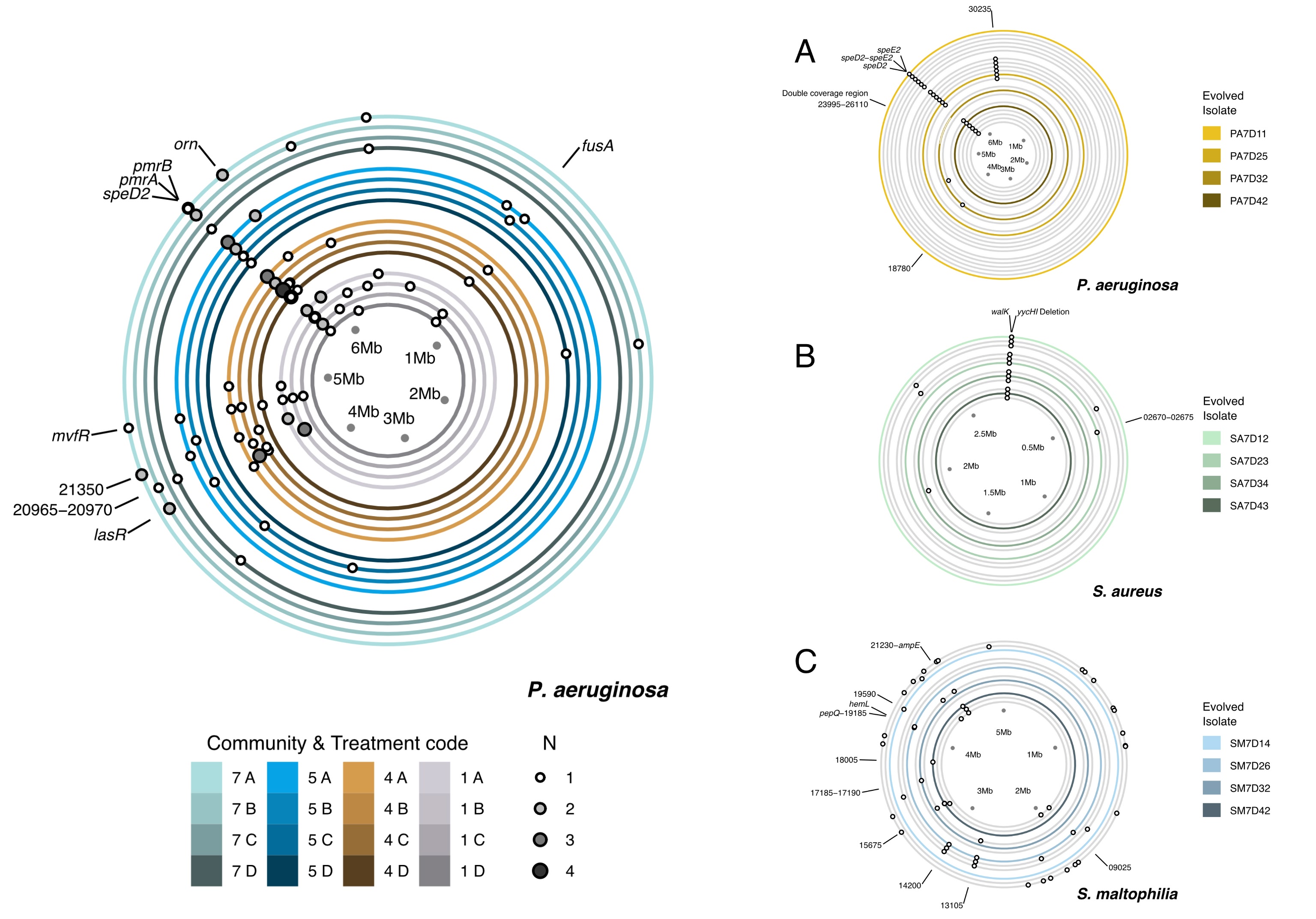
Thesis
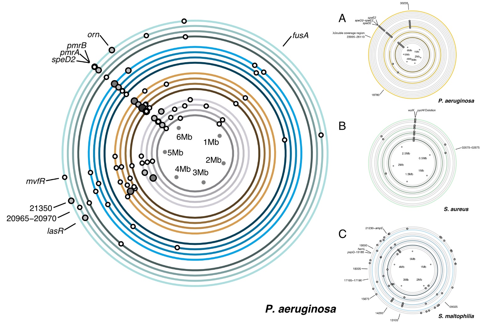
Genome
Mutations
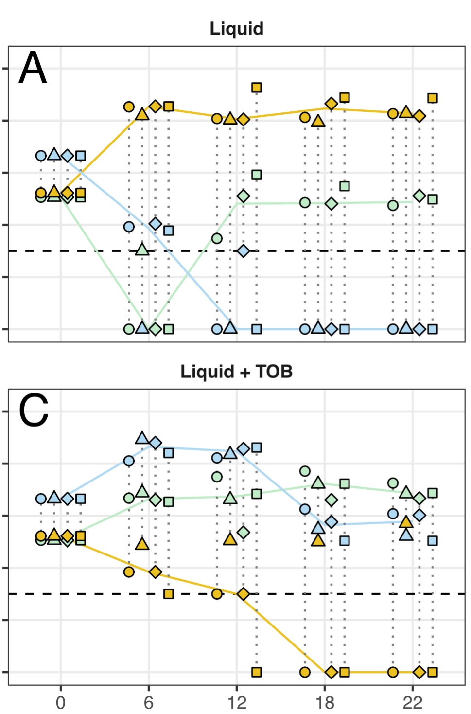
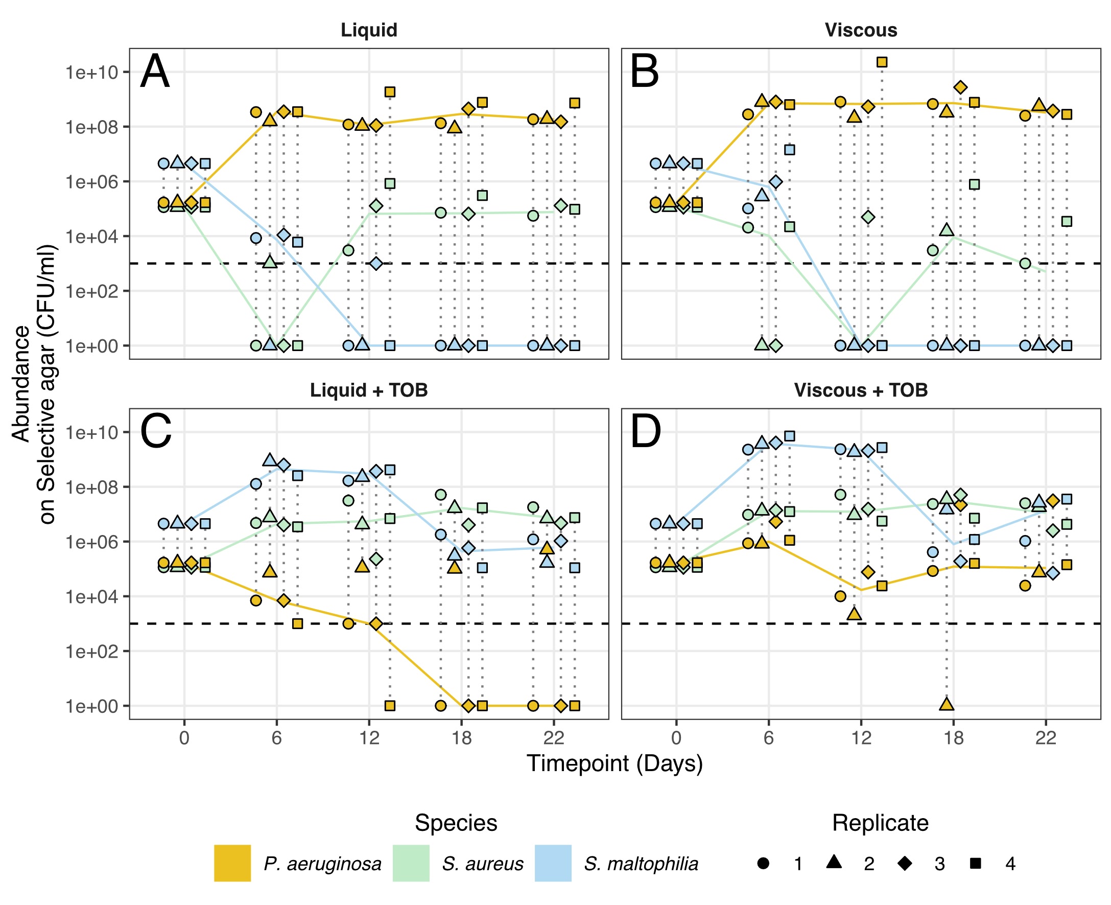
Population
Levels
Published Paper
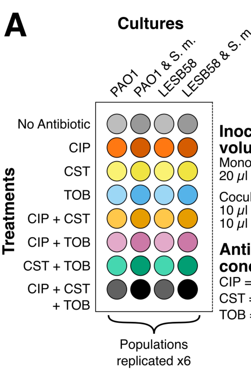
Methods
Schematic
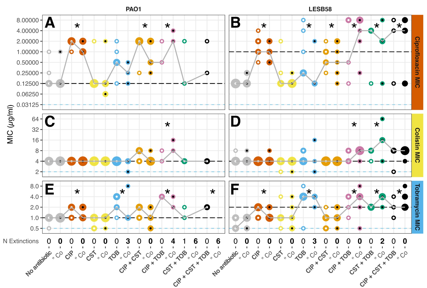
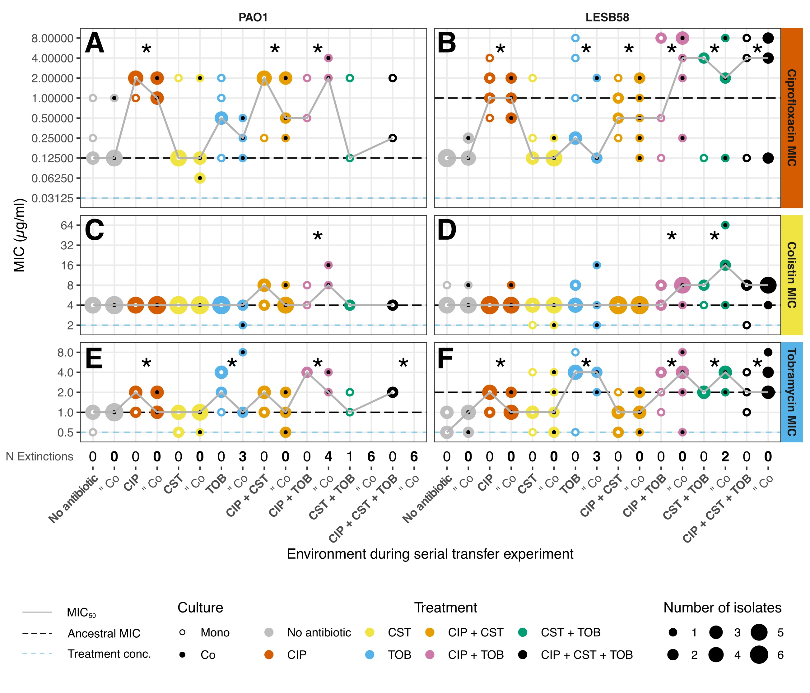
Minimum Inhibitory
Concentrations
Concentrations
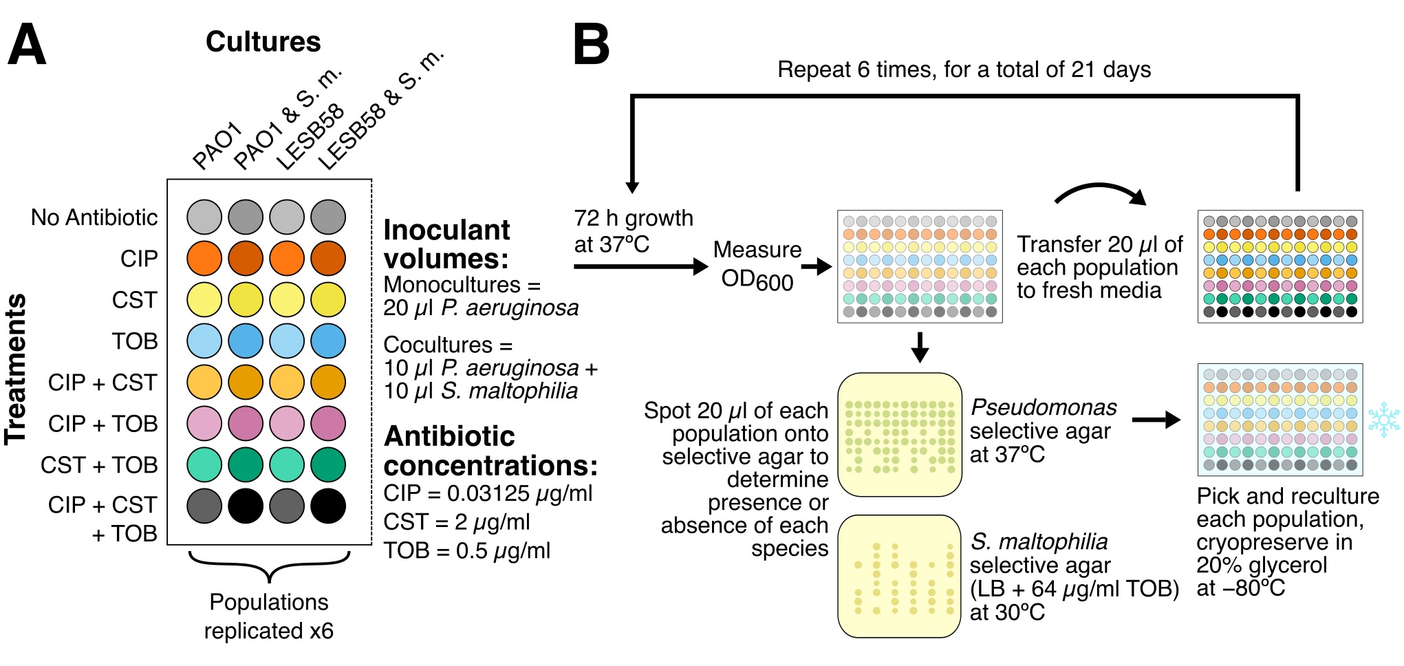
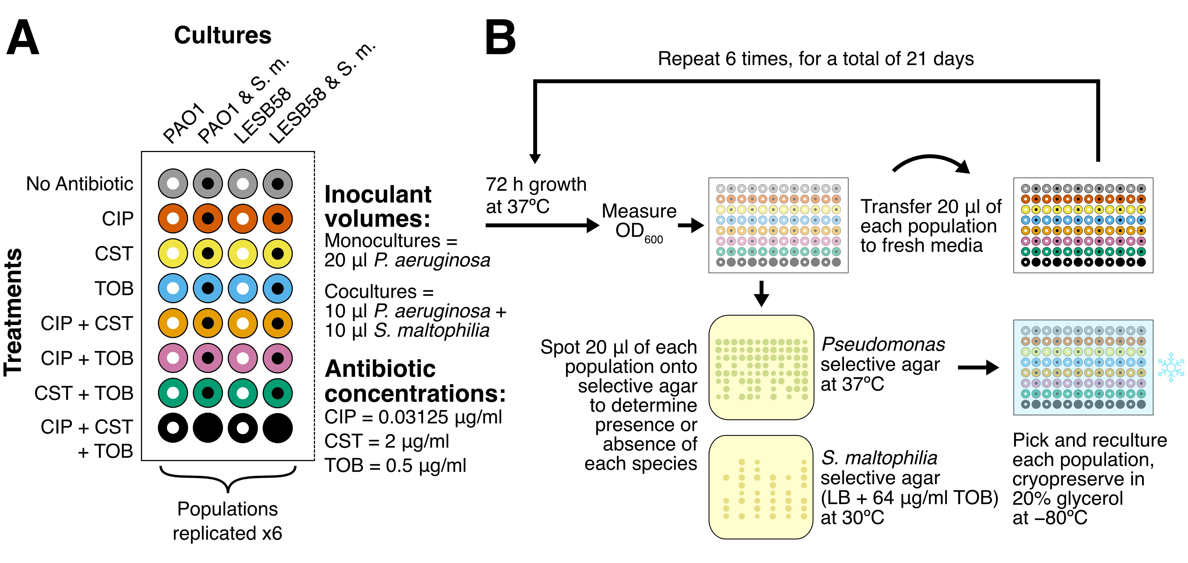
Experimental evolution is not a widespread technique, and reviewers for the paper found it difficult to follow the protocol based on text descriptions alone, particularly with the different combinations of antibiotics and species. I developed this figure to explain diagrammatically what was going on. For the non-biologists out there (which I assume is nearly all of you), the main iconography here is of a 96-well plate, which is a common tool that allows you to have multiple treatments and replicates in a small space.
- Distinguish the 8 different combinations of antibiotics.
- Because the combinations are made of three individual elements, one of my supervisors suggested primary colour mixing to represent them. I found a colourblind-friendly palette and assigned the combinations accordingly, with CIP as red, CST as yellow, and TOB as blue.
- Distinguish between monocultures (one species) and cocultures (two species).
- In this schematic I chose to distinguish the two by making the monocultures a lighter shade of the same colour—my thinking at the time being that there were fewer species in the monocultures, and so if more were added the colour would get darker.
This aligns with most other figures in the paper. However, in the following minimum inhibitory concentrations figure (which actually came first) I had used white and black dots for the mono- and cocultures instead. Looking back now, I dislike the light shade of the main colours—they're too similar to the white background—and would try to use the white and black dots throughout. I've mocked up a version of this schematic using the dots, shown below (along with some other minor adjustments I might make now).